


The canvas date/time picker is a stand-alone file that uses canvas elements for rendering. The picker is written in plain Javascript
and does not rely on any external dependencies such as CSS, Bootstrap, jQuery or React. The source code uses ES6 functionality so
the source may have to be transpiled to work on older browsers.
Instantiating a basic canvas date/time picker requires only a single line of Javascript. The picker has dozens of configuration options,
API function calls and callbacks.
For a basic date/time picker, only a div element id needs to be passed to the constructor.
Instantiation:
        <div id="my-dtp"></div>
        <script src="pathToSource/canvasDateTimePicker.js"></script>
        <script> new CanvDTP(document.getElementById("my-dtp")); </script>
Basic Date/Time Picker
The ability to collapse the body of the picker can be disabled on initialization. The canvas is collapsible by default.
Instantiation:
new CanvDTP(document.getElementById("myDTPid"), {isCollapsible: false});
Not Collapsible, Above Textbox
Not Collapsible, Below Textbox
Not Collapsible, No Textbox
The picker body can be placed in one of rour Orientations with respect to the textbox: lower left(default), lower right,
upper left or upper right. Constants are provided with the picker class: CanvDTP.POS_BOTLEFT, CanvDTP.POS_BOTRIGHT,
CanvDTP.POS_TOPLEFT, CanvDTP.POS_TOPRIGHT().
Instantiation:
new CanvDTP(document.getElementById("myDTPid"), {bodyPosition: CanvDTP.POS_BOTRIGHT});
Opens From
Bottom Right
Opens From
Top Left
Opend From
Top Right
The maximum width in pixels of the picker body can be specified. The picker body will never exceed the width of the textbox and icon.
Instantiation:
new CanvDTP(document.getElementById("myDTPid"), {maxPixelWidth: number});
250 Pixels Max Width
The expanding and collapsing animations of the picker body can be disabled.
Instantiation:
new CanvDTP(document.getElementById("myDTPid"), {isAnimated: false});
Open/Close Animation Disabled
By default, the picker is both for date and time. Class constants can be used to set the picker to time only or date only.
The constants available are: CanvDTP.PICK_BOTH, CanvDTP.PICK_DATE and CanvDTP.PICK_TIME.
Instantiation:
        new CanvDTP(document.getElementById("myDTPid"), {pickerType: CanvDTP.PICK_DATE});
        new CanvDTP(document.getElementById("myDTPid"), {pickerType: CanvDTP.PICK_TIME});
Time Picker Only
Date Picker Only
The date and time format of the picker is fully customizeable with a format string. The following list shows all
the specialized character sequences and how they affect the string:
M = No zero pad month. ***Can append ordinal***
MM = Zero padded month.
MMM = Abbreviated month name.
MMMM = Full month name.
D = No zero pad day. ***Can append ordinal***
DD = Zero padded day.
DDD = No zero pad day of year. ***Can append ordinal***
DDDD = Zero padded day of year.
W = No zero pad week of year. ***Can append ordinal***
WW = Zero padded week of year.
d = Day of week (0 - 6, Sunday through Saturday).
dd = Abbreviated day of week (Su, Mo, Tu, We, Th, Fr, Sa).
ddd = Abbreviated day of week (Sun, Mon, Tue, Wed, Thu, Fri, Sat).
dddd = Full day of week.
Y = 4 digit year.
YY = 2 digit year.
YYYY = 4 digit year.
H = No zero pad military hour.
HH = Zero padded military hour.
h = No zero pad standard hour.
hh = Zero padded standard hour.
m = No zero pad minute.
mm = Zero padded minute.
a = am/pm.
p = am/pm.
A = AM/PM.
P = AM/PM.
o = Ordinal. Add st, nd, rd, th to end of non-zero padded day, month, day of year and/or week of year.
[] = escaped characters.
Date/time format string example:
"dddd, MMMM Do YYYY h:mm a. DDDo [Day of the Year], Wo [Week of the Year]"
Displays as:
Sunday, April 5th 2020 8:38 pm. 96th Day of the Year, 15th Week of the Year
Instantiation:
new CanvDTP(document.getElementById("myDTPid"), {dateTimeFormat: string});
Custom Date/Time Format String
All the fonts on the calendar are controlled from a single parameter. By default, the font is "Arial". The font
string can changed to any supported font on the device rendering the picker. The following are examples of web safe
fonts that can be used: "Times New Roman", "Arial Black", "Comic Sans MS" and "Lucida Console".
Instantiation:
new CanvDTP(document.getElementById("myDTPid"), {fontStyle: string});
Arial Black Font
Comic Sans MS Font
Lucinda Console Font
When the picker is opened for the first time, by default the picker will try to pick todays date and time. The
auto-picking functionality can be disabled so no date is picked until the user selects one.
Instantiation:
new CanvDTP(document.getElementById("myDTPid"), {autoPick: false});
Auto-Pick Disabled
The calendar icon to the right of the textbox can be removed. If it is removed, the user will have to click on the textbox
to open the picker and click off the picker to close it again.
Instantiation:
new CanvDTP(document.getElementById("myDTPid"), {calendarIcon: false});
Calendar Icon Disabled
The text colors can be customized. The day of month header is a special case and has its own styling parameters.
There are five parameters assiciated with text color:
textMainColorn - The normal color of the majority of the text.
textMainColorh - The hover color of the majority of the text.
textAltColorn - The normal color of alternate text. This is text, for example, on the month view but is outside the range of the
current month.
textAltColorh - The hover color of alternate text.
rangeBkColor - The background color of date ranges beyond the user specified minimum and maximum.
Instantiation:
        new CanvDTP(document.getElementById("myDTPid"),
        {
            textMainColorn: "color string",
            textMainColorh: "color string",
            textAltColorn:  "color string",
            textAltColorh:  "color string",
            rangeBkColor:   "color string"
        });
Custom Text Colors
The date portion of the picker has four layers of views: month view, year view, decade view and century view.
By default, all four layers are enabled. The top layer can be set by parameters. Class constants are available
to set the top view: CanvDTP.CAL_CENTURY, CanvDTP.CAL_DECADE, CanvDTP.CAL_YEAR, CanvDTP.CAL_MONTH.
Instantiation:
        new CanvDTP(document.getElementById("myDTPid"), {topView: CanvDTP.CAL_DECADE});
        new CanvDTP(document.getElementById("myDTPid"), {topView: CanvDTP.CAL_YEAR});
        new CanvDTP(document.getElementById("myDTPid"), {topView: CanvDTP.CAL_MONTH});
Month, Year
and Decade Views
Month and
Year Views
Month Only
View
The first date and last date a picker can traverse can optionally be set. If a first or last date is given,
a month, day and year must be supplied. Class constants are available for the dates: CanvDTP.JANUARY,
CanvDTP.FEBRUARY, CanvDTP.MARCH, CanvDTP.APRIL, CanvDTP.MAY, CanvDTP.JUNE, CanvDTP.JULY, CanvDTP.AUGUST,
CanvDTP.SEPTEMBER, CanvDTP.OCTOBER, CanvDTP.NOVEMBER, CanvDTP.DECEMBER.
Instantiation:
        new CanvDTP(document.getElementById("myDTPid"),
        {
            firstDate:
            {
                month: number(1-12),
                day:   number(1-31),
                year:  number
            },
            lastDate:
            {
                month: number(1-12),
                day:   number(1-31),
                year:  number
            }
        });
Date Range 1/1/2000 - 12/31/2030
By default, today's date is initially picked when the picker opens. This can be changed to any date. It should be noted that if
the initial date is not available due to exclustsion or being outside the configured date ranges, the picker will open without
selecting an initial date. The image should be an HTML element on the page.
Instantiation:
        new CanvDTP(document.getElementById("myDTPid"),
        {
            initDate:
            {
                month: number(1-12),
                day:   number(1-31),
                year:  number
            }
        });
Default Date 12/25/1980
By default, an idicator highlighting today's date is visible on the calendar. It can be disabled.
Instantiation:
new CanvDTP(document.getElementById("myDTPid"), {todaysDate: false});
Today's Date Indicator Disabled
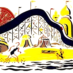
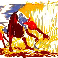
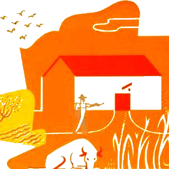
Background images can be selected for each of the twelve months. The array of images should have a length
of 12. If a particular month should not have an image, set its array element to null. The image should be
an HTML element on the page.
Instantiation:
        new CanvDTP(document.getElementById("myDTPid"),
        {
            monthImages:
            [
                {image: document.getElementById("myPicElement"), opacity: number(0.0-1.0)},
                {image: document.getElementById("myPicElement"), opacity: number(0.0-1.0)},
                {image: document.getElementById("myPicElement"), opacity: number(0.0-1.0)},
                {image: document.getElementById("myPicElement"), opacity: number(0.0-1.0)},
                {image: document.getElementById("myPicElement"), opacity: number(0.0-1.0)},
                {image: document.getElementById("myPicElement"), opacity: number(0.0-1.0)},
                {image: document.getElementById("myPicElement"), opacity: number(0.0-1.0)},
                {image: document.getElementById("myPicElement"), opacity: number(0.0-1.0)},
                {image: document.getElementById("myPicElement"), opacity: number(0.0-1.0)},
                {image: document.getElementById("myPicElement"), opacity: number(0.0-1.0)},
                {image: document.getElementById("myPicElement"), opacity: number(0.0-1.0)},
                {image: document.getElementById("myPicElement"), opacity: number(0.0-1.0)},
            ]
        });
Month Background Images
Days can be excluded from being picked. Days can also just be spotlighted. A whitelist can also be
created to exempt days that would otherwise be excluded or spotlighted.
The dayExcludeArray elements have the following structure:
        {
            days: [array of numbers(1-31)],
            daysOfWeek: [array of numbers(CanvDTP.SUNDAY-CanvDTP.SATURDAY)],
            months: [array of numbers(CanvDTP.JANUARY-CanvDTP.DECEMBER)],
            years: [arrays of numbers],
            excluded: boolean,
            color: "color string",
            info: "string"
        }
The days, daysOfWeek, months and years parameters must be in arrays even if it is only one item. All those values are optional. If one of those values is not given, the picker will assume that all values for that particular parameter are selected. For example, if the year parameter is not provided, the picker will assume the exclusion applies to all years. The excluded parameter tells the picker if the data is for an exclusion or a spotlight. An excluded day cannot be picked by the user where a spotlighted day can. The color parameter should be a valid color string ("#00ff00", for example). The color indicates the background color of the excluded/spotlighted day. The string parameter is an optional parameter that displays a given string when the user hovers over the excluded/spotlighted day.
The dayWhiteArray elements have the following structure:
        {
            days: [array of numbers(1-31)],
            daysOfWeek: [array of numbers(CanvDTP.SUNDAY-CanvDTP.SATURDAY)],
            months: [array of numbers(CanvDTP.JANUARY-CanvDTP.DECEMBER)],
            years: [arrays of numbers],
            type: number(CanvDTP.WHITE_BOTH, CanvDTP.WHITE_SPTLT, CanvDTP.WHITE_BLOCK, CanvDTP.WHITE_NONE)
        }
The days, daysOfWeek, months and years in the above object have the same functionality as in the exclusions array. The only difference is that this object reverses the exclusions/spotlights from above. The type parameter tells the picker which things to whitelist: exclusions, spotlights, both or neither.
Examples:
        //Exclude all days for all months and years. Whitelist the weekends.
        new CanvDTP(document.getElementById("myDTPid"),
        {
            dayExcludeArray:
            [
                {
                    excluded: true,
                    color: "#ff000080",
                    info: "All Weekdays Excluded"
                }
            ],
            dayWhiteArray:
            [
                {
                    daysOfWeek: [CanvDTP.SATURDAY, CanvDTP.SUNDAY],
                    type: CanvDTP.WHITE_BLOCK
                }
            ]
        });
All Days Excluded, Weekends Whitelisted
        //Weekends spotlighted
        new CanvDTP(document.getElementById("myDTPid"),
        {
            dayExcludeArray:
            [
                {
                    daysOfWeek: [CanvDTP.SATURDAY, CanvDTP.SUNDAY],
                    color: "#0000ff50"
                }
            ]
        });
Weekends Spotlighted
        //1/1/2020, 12/31/2021 Excluded.
        new CanvDTP(document.getElementById("myDTPid"),
        {
            dayExcludeArray:
            [
                {
                    days: [1],
                    months: [1],
                    years: [2020],
                    excluded: true,
                    color: "#ff0000",
                    info: "New Year's Excluded"
                },
                {
                    days: [31],
                    months: [12],
                    years: [2021],
                    excluded: true,
                    color: "#ff0000",
                    info: "Date Excluded"
                },
            ]
        });
1/1/2020, 12/31/2021 Excluded
        new CanvDTP(document.getElementById("myDTPid"),
        {
            dayExcludeArray:
            [
                {
                    daysOfWeek: [CanvDTP.MONDAY, CanvDTP.WEDNESDAY],
                    color: "#00ff00",
                    info: "Spotlighted Day"
                }
            ],
            dayWhiteArray:
            [
                {
                    months: [CanvDTP.FEBRUARY],
                    type: CanvDTP.WHITE_SPTLT
                }
            ]
        });
Mondays and Wednesdays Spotlighted Except in Februarys
Months can be spotlighted. A whitelist can also be created to exempt months that would otherwise be spotlighted.
The monthSpotlightArray elements have the following structure:
        {
            months: [array of numbers(CanvDTP.JANUARY-CanvDTP.DECEMBER)],
            years: [arrays of numbers],
            color: "color string",
            info: "string"
        }
The months and years parameters must be in arrays even if it is only one item. Those values are optional. If one of those values is not given, the picker will assume that all values for that particular parameter are selected. For example, if the year parameter is not provided, the picker will assume the spotlight applies to all years. The color parameter should be a valid color string ("#00ff00", for example). The color indicates the background color of the spotlighted month. The string parameter is an optional parameter that displays a given string when the user hovers over spotlighted month.
The monthWhiteArray elements have the following structure:
        {
            months: [array of numbers(CanvDTP.JANUARY-CanvDTP.DECEMBER)],
            years: [arrays of numbers]
        }
The months and years in the above object have the same functionality as in the spotlight array. The only difference is that this object reverses the spotlights from above.
Examples:
        //All Months Spotlighted, January Whitelisted
        new CanvDTP(document.getElementById("myDTPid"),
        {
            monthSpotlightArray:
            [
                {
                    color: "#00ff00",
                    info: "Spotlighted Month"
                }
            ],
            monthWhiteArray:
            [
                {
                    months: [CanvDTP.JANUARY],
                }
            ]
        });
All Months Spotlighted, January Whitelisted
        //January, March in 2020 Spotlighted.
        new CanvDTP(document.getElementById("myDTPid"),
        {
            monthSpotlightArray:
            [
                {
                    months: [CanvDTP.JANUARY, CanvDTP.MARCH],
                    years: [2020],
                    color: "#00ffff",
                    info: "Another Spotlighted Month"
                }
            ]
        });
January, March in 2020 Spotlighted
        //July Spotlighted in All Years.
        new CanvDTP(document.getElementById("myDTPid"),
        {
            monthSpotlightArray:
            [
                {
                    months: [CanvDTP.JULY],
                    color: "#0000ff80",
                    info: "July"
                }
            ]
        });
July Spotlighted in All Years
Years can be spotlighted. A whitelist can also be created to exempt years that would otherwise be spotlighted.
The yearSpotlightArray elements have the following structure:
        {
            years: [arrays of numbers],
            color: "color string",
            info: "string"
        }
The years parameter must be in arrays even if it is only one item. Its value is optional. If the value is not given, the picker will assume that all years are selected. The color parameter should be a valid color string ("#00ff00", for example). The color indicates the background color of the spotlighted year. The string parameter is an optional parameter that displays a given string when the user hovers over spotlighted year.
The yearWhiteArray elements have the following structure:
        {
            years: [arrays of numbers]
        }
The years in the above object have the same functionality as in the spotlight array. The only difference is that this object reverses the spotlights from above.
Examples:
        //Years 2010 - 2029 Spotlighted.
        new CanvDTP(document.getElementById("myDTPid"),
        {
            yearSpotlightArray:
            [
                {
                    years: [2010, 2011,  2012,  2013,  2014,  2015,  2016,  2017,  2018,  2019,
                            2020, 2021,  2022,  2023,  2024,  2025,  2026,  2027,  2028,  2029],
                    color: "#ff00ff",
                    info: "Spotlighted Years"
                }
            ]
        });
Years 2010 - 2029 Spotlighted
        //All Years Spotlighted, 2010 - 2029 Whitelisted.
        new CanvDTP(document.getElementById("myDTPid"),
        {
            yearSpotlightArray:
            [
                {
                    color: "#ffff00",
                    info: "More Spotlighted Years"
                }
            ],
            yearWhiteArray:
            [
                {
                    years: [2010, 2011,  2012,  2013,  2014,  2015,  2016,  2017,  2018,  2019,
                            2020, 2021,  2022,  2023,  2024,  2025,  2026,  2027,  2028,  2029],
                }
            ]
        });
All Years Spotlighted, 2010 - 2029 Whitelisted
The calendar icon to the right of the textbox has 11 parameters that control its appearance. They are fully
configurable. The following is a list of those parameters:
iBorderColorn: "color string" - Border color when icon not hovered.
iFillColorn: "color string" - Background color when icon not hovered.
iCalColorn: "color string" - color of calendar graphic when icon not hovered.
iBorderColorh: "color string" - Border color when icon hovered.
iFillColorh: "color string" - Background color when icon hovered.
iCalColorh: "color string" - color of calendar graphic when icon hovered.
iBorderRadius: number(0.0 - 1.0) - Corner radius fraction. 0.50 is fully rounded borders.
iBorderWeight: number(0.0 - 1.0) - Border thickness as a fraction of total icon height.
iXPadding: number(0.0 - 1.0) - Left and right icon padding as a fraction of total icon width.
iYPadding: number(0.0 - 1.0) - top and bottom icon padding as a fraction of total icon height.
iLineWidth: number(0.0 - 1.0) - Calendar icon line weight as a fraction of total icon height.
Example:
        //Custom Calendar Icon Parameters.
        new CanvDTP(document.getElementById("myDTPid"),
        {
            iBorderColorn: "#0000ff",
            iFillColorn: "#c000c0",
            iCalColorn: "#00ff00",
            iBorderColorh: "#ff0000",
            iFillColorh: "#30ff30",
            iCalColorh: "#ff00ff",
            iBorderRadius: 0,
            iBorderWeight: .10,
            iXPadding: .15,
            iYPadding: .15,
            iLineWidth: .001
        });
Custom Calendar Icon Styling
The body canvas has 6 parameters that control its appearance. They are fully
configurable. The following is a list of those parameters:
bBorderColor: "color string" - Border color.
bFillColor: "color string" - Background color.
bBorderRadius: number(0.0 - 1.0) - Corner radius fraction. 0.50 is fully rounded borders.
bBorderWeight: number(0.0 - 1.0) - Border thickness as a fraction of total body height.
bXPadding: number(0.0 - 1.0) - Left and right body padding as a fraction of total body width.
bYPadding: number(0.0 - 1.0) - top and bottom body padding as a fraction of total body height.
Example:
        //Custom Body Canvas Parameters.
        new CanvDTP(document.getElementById("myDTPid"),
        {
            bBorderColor: "#0000ff",
            bFillColor: "#d0d0fff0",
            bBorderRadius: 0.5,
            bBorderWeight: .001,
            bXPadding: .15,
            bYPadding: .40,
            bLineWidth: .2
        });
Custom Body Canvas Styling
There are 6 parameters that control the info text styling. The info text appears over excluded/whitelisted
items on a mouse hover. The following is a list of those parameters:
infoPointerSize: "string" - Sets the CSS style, usually in pixels. "10px", for example.
infoBackColor: "color string" - Background color.
infoTextColor: "color string" - Text color.
infoPadding: "string" - Sets the CSS pagging values. "2px, 5px", for example
infoWidth: "string" - Sets the CSS width of the info text box.
infoBorderRadius: - Sets the CSS border radius. "10px", for example.
Example:
        //Custom Info Text Parameters.
        new CanvDTP(document.getElementById("myDTPid"),
        {
            infoPointerSize: "75px",
            infoBackColor: "#c0c000",
            infoTextColor: "#ff0000",
            infoPadding: "2px, 5px",
            infoWidth: "150px",
            infoBorderRadius: "10px 10px 0px 0px",

            dayExcludeArray:
            [
                {
                    daysOfWeek: [CanvDTP.SATURDAY, CanvDTP.SUNDAY],
                    color: "#0000ff80",
                    info: "Weekend Days Spotlighted"
                }
            ]
        });
Custom Info Text Styling
There are 4 parameters that control the selectable items styling.
The following is a list of those parameters:
selectBorderColor: "color string" - Border color.
selectFillColor "color string" - Background color.
selectRadius: number(0.0 - 1.0) - Corner radius fraction. 0.50 is fully rounded borders.
selectWeight: number(0.0 - 1.0) - Border thickness as a fraction of total body height.
Example:
        //Custom Selectable Items Parameters.
        new CanvDTP(document.getElementById("myDTPid"),
        {
            selectBorderColor: "#ff0000",
            selectFillColor: "#80000040",
            selectRadius: .50,
            selectWeight: .01
        });
Custom Selectable Item Styling
There are 2 parameters that control the Previous/Next styling.
The following is a list of those parameters:
prevNextXPad: number(0.0 - 1.0) - Left and right padding as a fraction of total width.
prevNextYPad: number(0.0 - 1.0) - top and bottom padding as a fraction of total height.
Example:
        //Custom Previous/Next Parameters.
        new CanvDTP(document.getElementById("myDTPid"),
        {
            prevNextXPad: 0,
            prevNextYPad: .35
        });
Custom Previous / Next Styling
There are 2 parameters that control the Clock Graphic styling.
The following is a list of those parameters:
clockPad: number(0.0 - 1.0) - padding as a fraction of total width.
clockWeight: number(0.0 - 1.0) - Line thickness as a fraction of total body height.
Example:
        //Custom Clock Graphic Parameters.
        new CanvDTP(document.getElementById("myDTPid"),
        {
            clockPad: .20,
            clockWeight: .15
        });
Custom Clock Graphic Styling
There are 3 parameters that control the Calendar Graphic styling on the time view.
The following is a list of those parameters:
calXPadding: number(0.0 - 1.0) - Left and right padding as a fraction of total width.
calYPadding: number(0.0 - 1.0) - top and bottom padding as a fraction of total height.
calLineWidth: number(0.0 - 1.0) - Line weight as a fraction of total icon height.
Example:
        //Custom Calendar Graphic Parameters.
        new CanvDTP(document.getElementById("myDTPid"),
        {
            calXPadding: .001,
            calYPadding: .20,
            calLineWidth: .015
        });
Custom Calendar Graphic Styling
There are 2 parameters that control the Days of Week Header styling.
The following is a list of those parameters:
headerColor: "color string" - Text color.
headerScale: number(0.0 - 1.0) - Total space taken by the header text.
Example:
        //Custom Days of Week Header Parameters.
        new CanvDTP(document.getElementById("myDTPid"),
        {
            headerColor: "#ffff00",
            headerScale: .40
        });
Custom Days of Week Header Styling
There are 4 parameters that control the Currently Selected Day styling.
The following is a list of those parameters:
currentBorderColor: "color string" - Border color.
currentFillColor: "color string" - Background color.
currentRadius: number(0.0 - 1.0) - Corner radius fraction. 0.50 is fully rounded borders.
currentWeight: number(0.0 - 1.0) - Border thickness as a fraction of total body height.
Example:
        //Custom Currently Selected Day Parameters.
        new CanvDTP(document.getElementById("myDTPid"),
        {
            currentBorderColor: "#ff0000",
            currentFillColor: "#d0000080",
            currentRadius: .50,
            currentWeight: .10
        });
Custom Currently Selected Day Styling
There are 2 parameters that control the Currently Today's Date styling.
The following is a list of those parameters:
nowColor: "color string" - Graphic color.
nowWeight: number(0.0 - 1.0) - Graphic size as a fraction of total body height.
Example:
        //Custom Today's Date Parameters.
        new CanvDTP(document.getElementById("myDTPid"),
        {
            nowColor: "#0000ff",
            nowWeight: .30
        });
Custom Today's Date Styling
There are 3 parameters that control the Increment/Decrement Time styling.
The following is a list of those parameters:
incXPad: number(0.0 - 1.0) - Left and right padding as a fraction of total width.
incYPad: number(0.0 - 1.0) - top and bottom padding as a fraction of total height.
incWeight: number(0.0 - 1.0) - Line weight as a fraction of total height.
Example:
        //Custom Increment/Decrement Parameters.
        new CanvDTP(document.getElementById("myDTPid"),
        {
            incXPad: .40,
            incYPad: .40,
            incWeight: .10
        });
Custom Increment / Decrement Time Styling
There are 9 parameters that control the Text Scaling styling.
The following is a list of those parameters:
bannerScale: number(0.0 - 1.0) - Banner at top of date views.
dayScale: number(0.0 - 1.0) - Day numbers in month view.
monthScale: number(0.0 - 1.0) - Month names in year view.
yearScale: number(0.0 - 1.0) - Years numbers in decade view.
decadeScale: number(0.0 - 1.0) - Decade ranges in century view.
timeScale: number(0.0 - 1.0) - Time hour and minute.
timeAmPmScale: number(0.0 - 1.0) - AP/PM text.
minuteScale: number(0.0 - 1.0) - Minute numbers in minute view.
hourScale: number(0.0 - 1.0) - Hour numbers in hour view.
Example:
        //Custom Text Scale Parameters.
        new CanvDTP(document.getElementById("myDTPid"),
        {
            bannerScale: .50,
            dayScale: .30,
            monthScale: .30,
            yearScale: .30,
            decadeScale: .20,
            timeScale: .30,
            timeAmPmScale: .30,
            minuteScale: .30,
            hourScale: .30
        });
Custom Text Scaling Styling
The z-index of the body canvas can be changed if its overlap properties need to modified.
Instantiation:
new CanvDTP(document.getElementById("myDTPid"), {zIndex: number});
A special debugging mode can be activated to ensure the text alignment is set up properly.
Instantiation:
new CanvDTP(document.getElementById("myDTPid"), {debug: true});
Debug Enabled
Get the currently selected date and time string. Returns a string.
Usage:
let myVar = myDTP.getDateTimeString();
Date/Time String Value
Date-Time String:Get the date and time data for the currenctly selected date and time. The call returns the following data:
        {
            isPicked: boolean - Indicates if something is even selected.
            string: "string" - String version of the date and time.
            month: number(1-2) - picked month of year.
            day: number(1-31) - picked day of month.
            year: number - picked year.
            hour: number(1-12) - Standard time picked hour.
            milHour: number(0-23) - Military time picked hour.
            minute: number(0-59) - Picked minute.
            ampm: "string" - "AM" or "PM".
            dayOfWeek: number(0-6) - Picked day of week(0 = Sunday).
            dayOfYear: number(1-356) - picked day of year.
            weekOfYear: number(1-54) - picked week of year.
        }
Usage:
let myVar = myDTP.getDateTimeJSON();
JSON Return Values
Is Picked:String:
Month:
Day:
Year:
Day Of Week:
Day Of Year:
Week Of Year:
Hour:
Military Hour:
Minute:
AM/PM:
setPickerType - Set the picker as time only, date only or both date and time.
getPickerType - Returns the current picker type.
The class provides constants for the picker type: CanvDTP.PICK_BOTH, CanvDTP.PICK_DATE, CanvDTP.PICK_TIME.
Examples:
        myDTP.setPickerType(CanvDTP.PICK_BOTH);
        myDTP.setPickerType(CanvDTP.PICK_DATE);
        myDTP.setPickerType(CanvDTP.PICK_TIME);
        let myVar = myDTP.getPickerType();
Picker Type
Type:
setDayExcludeArray - Sets the contents of the day exclusion array. Replaces any existing data.
getDayExcludeArray - Returns a copy of the entire contents of the day exclusion array.
Examples:
        //Exclude all weekdays.
        myDTP.setDayExcludeArray
        (
            [
                {
                    daysOfWeek:
                    [
                        CanvDTP.MONDAY, CanvDTP.TUESDAY, CanvDTP.WEDNESDAY,
                        CanvDTP.THURSDAY, CanvDTP.FRIDAY
                    ],
                    excluded: true,
                    color: "#ff000080",
                    info: "All Weekdays Excluded"
                }
            ]
        );

        //Exclude all weekends.
        myDTP.setDayExcludeArray
        (
            [
                {
                    daysOfWeek: [CanvDTP.SUNDAY, CanvDTP.SATURDAY],
                    excluded: true,
                    color: "#ff000080",
                    info: "All Weekends Excluded"
                }
            ]
        );

        //Get exclusion array.
        let data = myDTP.getDayExcludeArray();
Day Exclusions Array
Exclusion Array:
setDayWhiteArray - Sets the contents of the day whitelist array. Replaces any existing data.
getDayWhiteArray - Returns a copy of the entire contents of the day whitelist array.
Examples:
        //Whitelist all weekdays.
        myDTP.setDayWhiteArray
        (
            [
                {
                    daysOfWeek: [CanvDTP.MONDAY, CanvDTP.TUESDAY, CanvDTP.WEDNESDAY, CanvDTP.THURSDAY, CanvDTP.FRIDAY],
                    type: CanvDTP.WHITE_BLOCK
                }
            ]
        );

        //Whitelist all weekends.
        myDTP.setDayWhiteArray
        (
            [
                {
                    daysOfWeek: [CanvDTP.SATURDAY, CanvDTP.SUNDAY],
                    type: CanvDTP.WHITE_BLOCK
                }
            ]
        );

        //Get day whitelist array.
        let data = myDTP.getDayWhiteArray();
Day Whitelist Array
setMonthSpotlightArray - Sets the contents of the month spotlight array. Replaces any existing data.
getMonthSpotlightArray - Returns a copy of the entire contents of the month spotlight array.
Examples:
        //Spotlight January, Febuary, March.
        myDTP.setMonthSpotlightArray
        (
            [
                {
                    months: [CanvDTP.JANUARY, CanvDTP.FEBRUARY, CanvDTP.MARCH],
                    color: "#0000ff",
                    info: "Spotlighted Month"
                }
            ]
        );

        //Spotlight October, November, December.
        myDTP.setMonthSpotlightArray
        (
            [
                {
                    months: [CanvDTP.OCTOBER, CanvDTP.NOVEMBER, CanvDTP.DECEMBER],
                    color: "#0000ff",
                    info: "Another Spotlighted Month"
                }
            ]
        );

        //Get month spotlight array.
        let data = myDTP.getMonthSpotlightArray();
Month Spotlight Array
setMonthWhiteArray - Sets the contents of the month whitelist array. Replaces any existing data.
getMonthWhiteArray - Returns a copy of the entire contents of the month whitelist array.
Examples:
        //Whitelist January, Febuary, March.
        myDTP.setDayWhiteArray
        (
            [
                {
                    months: [CanvDTP.JANUARY, CanvDTP.FEBRUARY, CanvDTP.MARCH]
                }
            ]
        );

        //Whitelist October, November, December.
        myDTP.setDayWhiteArray
        (
            [
                {
                    months: [CanvDTP.OCTOBER, CanvDTP.NOVEMBER, CanvDTP.DECEMBER]
                }
            ]
        );

        //Get month whitelist array.
        let data = myDTP.getDayWhiteArray();
Month Whitelist Array
setYearSpotlightArray - Sets the contents of the year spotlight array. Replaces any existing data.
getYearSpotlightArray - Returns a copy of the entire contents of the year spotlight array.
Examples:
        //Spotlight 2020-2024.
        myDTP.setYearSpotlightArray
        (
            [
                {
                    years: [2020, 2021, 2022, 2023, 2024],
                    color: "#0000ff",
                    info: "Spotlighted Year"
                }
            ]
        );

        //Spotlight 2025-2029.
        myDTP.setYearSpotlightArray
        (
            [
                {
                    months: [2025, 2026, 2027, 2028, 2029],
                    color: "#0000ff",
                    info: "Another Spotlighted Year"
                }
            ]
        );

        //Get month spotlight array.
        let data = myDTP.getYearSpotlightArray();
Year Spotlight Array
setYearWhiteArray - Sets the contents of the year whitelist array. Replaces any existing data.
getYearWhiteArray - Returns a copy of the entire contents of the year whitelist array.
Examples:
        //Whitelist 2020-2024
        myDTP.setYearWhiteArray
        (
            [
                {
                    years: [2020, 2021, 2022, 2023, 2024]
                }
            ]
        );

        //Whitelist 2025-2029
        myDTP.setYearWhiteArray
        (
            [
                {
                    years: [2025, 2026, 2027, 2028, 2029]
                }
            ]
        );

        //Get year whitelist array.
        let data = myDTP.getYearWhiteArray();
Year Whitelist Array
setMonthImageArray - Sets the contents of the month image array. Replaces any existing data.
getMonthImageArray - Returns a copy of the entire contents of the month image array.
Examples:
        //Add images to Jan, Feb and March.
        myDTP.setMonthImageArray
        (
            [
                {image: document.getElementById("january"), opacity: 0.4},
                {image: document.getElementById("february"), opacity: 0.4},
                {image: document.getElementById("march"), opacity: 0.4},
                null,
                null,
                null,
                null,
                null,
                null,
                null,
                null,
                null
            ]
        );

        //Add images to Oct, Nov and Dec.
        myDTP.setMonthImageArray
        (
            [
                null,
                null,
                null,
                null,
                null,
                null,
                null,
                null,
                null,
                {image: document.getElementById("october"), opacity: 0.4},
                {image: document.getElementById("november"), opacity: 0.4},
                {image: document.getElementById("december"), opacity: 0.4},
            ]
        );

        //Get month images array.
        let data = myDTP.getMonthImageArray();
Month Image Array
Get and set the font colors in the body canvas.
setFontColors - Set the font colors in the body canvas.
getFontColors - Get the font colors in the body canvas.
The following object is passed as a parameter to the setFontColors function and returned from the getFontColors function:
        {
            textMainColorn: "color string",  //The primary color for non-hovered items.
            textMainColorh: "color string",  //The primary color for hovered items.
            textAltColorn:  "color string",  //The alternate for non-hovered items.
            textAltColorh:  "color string",  //The alternate for hovered items.
            rangeBkColor:   "color string"   //Out of range date colors.
        }
Examples:
        //Set default font colors.
        myDTP.setFontColors
        (
            {
                textMainColorn: "#000000",
                textMainColorh: "#ffffff",
                textAltColorn:  "#888888",
                textAltColorh:  "#ff8888",
                rangeBkColor:   "#000000a0"
            }
        );

        //Set custom font colors.
        myDTP.setFontColors
        (
            {
                textMainColorn: "#0000ff",
                textMainColorh: "#ffff00",
                textAltColorn:  "#ff0000",
                textAltColorh:  "#ff00ff",
                rangeBkColor:   "#808080"
            }
        );

        //Get font colors.
        let myVar = myDTP.setFontColors();
Font Colors
Get or set the date/time format string. See the Custom Date/Time String subsection in the parameters
section for details on the string formatting.
setDateTimeFormat - Set date/time format string.
getDateTimeFormat - Get date/time format string.
Examples:
        //Set date/time format string.
        myDTP.setDateTimeFormat(myString);

        //Get date/time format string.
        let myVar = myDTP.getDateTimeFormat();
Date/Time Format String
Get or set whether or not the bondy canvas is animated on open or close.
setIsAnimated - Set animation prooperty of body canvas.
getIsAnimated - Get animation prooperty of body canvas.
Examples:
        //Set animation prooperty of body canvas.
        myDTP.setIsAnimated(true);
        myDTP.setIsAnimated(false);

        //Get animation prooperty of body canvas.
        let myVar = myDTP.getIsAnimated();
Body Canvas Animation
Get or set the maximum width in pixels of the body canvas. The body canvas will nexer exceed
the width of the textbox and calendar icon. Setting to null will maximize the body canvas.
setMaxPixelWidth - Set the maximum width in pixels of the body canvas.
getMaxPixelWidth - Get the maximum width in pixels of the body canvas.
Examples:
        //Set the maximum width in pixels of the body canvas.
        myDTP.setStartOfWeek(null);
        myDTP.setStartOfWeek(250);

        //Get the maximum width in pixels of the body canvas.
        let myVar = myDTP.getStartOfWeek();
Body Canvas Max Pixel Width
Get or set the starting day of the week. Class constants can be used: CanvDTP.SUNDAY,
CanvDTP.MONDAY, CanvDTP.TUESDAY, CanvDTP.WEDNESDAY, CanvDTP.THURSDAY, CanvDTP.FRIDAY,
CanvDTP.SATURDAY. Sunday is the default
setStartOfWeek - Set starting day of the week.
getStartOfWeek - Get starting day of the week.
Examples:
        //Set starting day of the week.
        myDTP.setStartOfWeek(CanvDTP.SUNDAY);
        myDTP.setStartOfWeek(CanvDTP.MONDAY);
        myDTP.setStartOfWeek(CanvDTP.TUESDAY);
        myDTP.setStartOfWeek(CanvDTP.WEDNESDAY);
        myDTP.setStartOfWeek(CanvDTP.THURSDAY);
        myDTP.setStartOfWeek(CanvDTP.FRIDAY);
        myDTP.setStartOfWeek(CanvDTP.SATURDAY);

        //Get starting day of the week.
        let myVar = myDTP.getStartOfWeek();
Start Day of Week
Get or set the military time or standard time
setIsMilitaryTime - Set military or standard time.
getIsMilitaryTime - Get military or standard time.
Examples:
        //Set military or standard time.
        myDTP.setIsMilitaryTime(true);
        myDTP.setIsMilitaryTime(false);

        //Get military or standard time.
        let myVar = myDTP.getIsMilitaryTime();
Is Military Time
Get or set the font style of calendar text. Arial is the default font
setFontStyle - Set the font style of calendar text.
getFontStyle - Get the font style of calendar text.
Examples:
        //Set the font style of calendar text.
        myDTP.setFontStyle("Arial");
        myDTP.setFontStyle("Arial Black");
        myDTP.setFontStyle("Comic Sans MS");
        myDTP.setFontStyle("Lucida Console");

        //Get the visibility of the today's date indicator.
        let myVar = myDTP.getFontStyle();
Font Style
The setDateRanges function sets the first and last dates. each date is an object that must contain a day, month and year.
If an invalid day, month or year is passed in firstDate or lastDate, that date will be unbounded. If only one end needs
to be bounded, only a firstDate or lastDate can be passed.
setDateRanges - Set first and last date.
getDateRanges - Get first and last date.
The following object is passed as a parameter to the setDateRanges function and returned from the getDateRanges function:
        {
            firstDate:
            {
                month: number(1-12),
                day:   number(1-31),
                year:  number
            },
            lastDate:
            {
                month: number(1-12),
                day:   number(1-31),
                year:  number
            }
        }
Examples:
        //Set date range from 1/1/2000 to 12/1/2029.
        myDTP.setDateRanges
        (
            {
                firstDate:
                {
                    day:   1,
                    month: 2,
                    year:  2000
                },
                lastDate:
                {
                    day:   11,
                    month: 30,
                    year:  2029
                }
            }
        );

        //Clear date ranges.
        myDTP.setDateRanges
        (
            {
                firstDate: {},
                lastDate:  {}
            }
        );

        //Get today's date.
        let myVar = myDTP.getDateRanges();
Date Ranges
Hide or show the today's date indicator on the calendar.
setTodayIndicator - Set the visibility of the today's date indicator.
getTodayIndicator - Get the visibility of the today's date indicator.
Examples:
        //Set the visibility of the today's date indicator.
        myDTP.setTodayIndicator(true);
        myDTP.setTodayIndicator(false);

        //Get the visibility of the today's date indicator.
        let myVar = myDTP.getTodayIndicator();
Today's Date Visibility
The setTodaysDate function can be used to set the current date on the calendar. This can be used to override the local date with a guaranteed accurate server date, for example. NOTE: This is not the same as the selected date. This is primarily for drawing today's date indicator on the calendar. setTodaysDate - Set today's date. getTodaysDate - Get today's date.
Examples:
        //Set today's date.
        myDTP.setTodaysDate
        (
            {
                day:   number(1-31),
                month: number(1-12),
                year:  number
            }
        );

        //Get today's date.
        let myVar = myDTP.getTodaysDate();
Today's Date
The top view of the date picker can be set. By default, the century view is the highest view.
Class constants can be used to set the highest view: CanvDTP.CAL_CENTURY, CanvDTP.CAL_DECADE,
CanvDTP.CAL_YEAR, CanvDTP.CAL_MONTH
setTopView - Set the top view of the date picker.
getTopView - Get the top view of the date picker.
Examples:
        //Set the top view of the date picker.
        myDTP.setTopView(CanvDTP.CAL_CENTURY;
        myDTP.setTopView(CanvDTP.CAL_DECADE);
        myDTP.setTopView(CanvDTP.CAL_YEAR);
        myDTP.setTopView(CanvDTP.CAL_MONTH);

        //Get the top view of the date picker.
        let myVar = myDTP.getTopView();
Top View Value
The calendar icon next to the textbox can be disabled using these functions. The calendar icon is enabled by default.
setCalendarIcon - Set the visibility status of the calendar icon.
getCalendarIcon - Get the visibility status of the calendar icon.
Examples:
        //Set the visibility of the calendar icon.
        myDTP.setCalendarIcon(true);
        myDTP.setCalendarIcon(false);

        //Get the visibility of the calendar icon.
        let myVar = myDTP.getCalendarIcon();
Calendar Visibility
The isCollapsible parameter determines if the user can collapse the body canvas so only the textbox is shown.
setIsCollapsible - Set the body isCollapsible parameter.
getIsCollapsible - Get the body isCollapsible parameter.
Examples:
        //Set isCollapsible parameter.
        myDTP.setIsCollapsible(true);
        myDTP.setIsCollapsible(false);

        //Get isCollapsible parameter.
        let myVar = myDTP.getIsCollapsible();
Collapsibility
The body position parameter sets the position of the body canvas with respect to the textbox. Class constants are
provided for choosing one of four different positions: CanvDTP.POS_BOTLEFT(default), CanvDTP.POS_BOTRIGHT,
CanvDTP.POS_TOPLEFT or CanvDTP.POS_TOPRIGHT
setBodyPosition - Set the body position parameter.
getBodyPosition - Get the body position parameter.
Examples:
        //Set body position parameter.
        myDTP.setBodyPosition(CanvDTP.POS_BOTLEFT);
        myDTP.setBodyPosition(CanvDTP.POS_BOTRIGHT);
        myDTP.setBodyPosition(CanvDTP.POS_TOPLEFT);
        myDTP.setBodyPosition(CanvDTP.POS_TOPRIGHT);

        //Get body position parameter.
        let myVar = myDTP.getBodyPosition();
Body Canvas Position
The day vertical offset parameter sets an adjustment for the days of the month. Some fonts may not be vertically centered.
This adjustment can offset this. The dimension is a fraction based on the corresponding cointainer height.
setDayVertOffset - Set the vertical offset parameter.
getDayVertOffset - Get the vertical offset parameter.
Examples:
        //Set default icon canvas parameters.
        myDTP.setDayVertOffset(.05);

        //Set custom icon canvas parameters.
        myDTP.setDayVertOffset(.20);

        //Get icon canvas parameters.
        let myVar = myDTP.getDayVertOffset();
Day Vertical Offset Value
The icon canvas parameters set the style of the icon canvas. It is composed of five dimension parameters
and six color parameters. The dimensions are a fraction based on the corresponding cointainer height.
setIconCanvasParams - Set the parameters of the icon canvas.
getIconCanvasParams - Get the parameters of the icon canvas.
The following object is passed as a parameter to the setIconCanvasParams function and returned from the getIconCanvasParams function:
        {
            iBorderColorn: Border color, not hovered,
            iFillColorn:   Background color, not hovered,
            iCalColorn:    Line color, not hovered,
            iBorderColorh: Border color, hovered,
            iFillColorh:   Background color, hovered,
            iCalColorh:    Line color, hovered,
            iBorderRadius: Border corner radius,
            iBorderWeight: Border thickness,
            iXPadding:     Left and right padding,
            iYPadding:     Top and bottom padding,
            iLineWidth:    Line thickness
        }
Examples:
        //Set default icon canvas parameters.
        myDTP.setIconCanvasParams
        (
            {
                iBorderColorn: "#a0a0a0",
                iFillColorn:   "#d0d0d0",
                iCalColorn:    "#000000",
                iBorderColorh: "#202020",
                iFillColorh:   "#808080",
                iCalColorh:    "#ffffff",
                iBorderRadius: .20,
                iBorderWeight: .05,
                iXPadding:     .20,
                iYPadding:     .20,
                iLineWidth:    .02
            }
        );

        //Set custom icon canvas parameters.
        myDTP.setIconCanvasParams
        (
            {
                iBorderColorn: "#0000ff",
                iFillColorn:   "#c000c0",
                iCalColorn:    "#00ff00",
                iBorderColorh: "#ff0000",
                iFillColorh:   "#30ff30",
                iCalColorh:    "#ff00ff",
                iBorderRadius: .00,
                iBorderWeight: .10,
                iXPadding:     .10,
                iYPadding:     .10,
                iLineWidth:    .001
            }
        );

        //Get icon canvas parameters.
        let myVar = myDTP.getIconCanvasParams();
Icon Canvas Values
The body canvas parameters set the style of the body canvas. It is composed of four dimension parameters
and two color parameters. The dimensions are a fraction based on the corresponding cointainer height.
setBodyCanvasParams - Set the parameters of the body canvas.
getBodyCanvasParams - Get the parameters of the body canvas.
The following object is passed as a parameter to the setBodyCanvasParams function and returned from the getBodyCanvasParams function:
        {
            bBorderColor:  Border color,
            bFillColor:    Background color,
            bBorderRadius: Border corner radius,
            bBorderWeight: Border Thickness,
            bXPadding:     Left and right content padding,
            bYPadding:     Top and bottom content padding
        }
Examples:
        //Set default body canvas parameters.
        myDTP.setBodyCanvasParams
        (
            {
                bBorderColor:  "#707070",
                bFillColor:    "#e0e0e0",
                bBorderRadius: .05,
                bBorderWeight: .01,
                bXPadding:     .10,
                bYPadding:     .10
            }
        );

        //Set custom body canvas parameters.
        myDTP.setBodyCanvasParams
        (
            {
                bBorderColor:  "#0000ff",
                bFillColor:    "#000050",
                bBorderRadius: .50,
                bBorderWeight: .10,
                bXPadding:     .30,
                bYPadding:     .30
            }
        );

        //Get body canvas parameters.
        let myVar = myDTP.getBodyCanvasParams();
Body Canvas Values
The info text parameters are different than the other parameters. The infotext is not part of the canvas but is composed of
HTML elements. All the info text parameters are strings used to set the CSS.
setInfoTextParams - Set the parameters of the info text.
getInfoTextParams - Get the parameters of the info text.
The following object is passed as a parameter to the setInfoTextParams function and returned from the getInfoTextParams function:
        {
            infoPointerSize:  The width of the pointer that points to the hovered item,
            infoBackColor:    The background color of the info text,
            infoTextColor:    The text color of the info text,
            infoPadding:      Padding around the info text,
            infoWidth:        The total width of the info text structure,
            infoBorderRadius: Border radius of the ingo text body.
        }
Examples:
        //Set default info text parameters.
        myDTP.setInfoTextParams
        (
            {
                infoPointerSize:  "10px",
                infoBackColor:    "#000000a0",
                infoTextColor:    "#ffffff",
                infoPadding:      "2px, 5px",
                infoWidth:        "150px",
                infoBorderRadius: "10px"
            }
        );

        //Set custom info text parameters.
        myDTP.setInfoTextParams
        (
            {
                infoPointerSize: "75px",
                infoBackColor: "#c0c000",
                infoTextColor: "#ff0000",
                infoPadding: "2px, 5px",
                infoWidth: "150px",
                infoBorderRadius: "10px 10px 0px 0px"
            }
        );

        //Get info text parameters.
        let myVar = myDTP.getInfoTextParams();
Info Text Values
The selectable item parameters set the style of the selectable items on hover. It is composed of two dimension parameters
and two color parameters. The dimensions are a fraction based on the corresponding cointainer height.
setSelectableParams - Set the parameters of the selectable item.
getSelectableParams - Get the parameters of the selectable item.
The following object is passed as a parameter to the setSelectableParams function and returned from the getSelectableParams function:
        {
            selectBorderColor: Border color,
            selectFillColor:   Fill color,
            selectRadius:      Border radius,
            selectWeight:      Border thickness
        }
Examples:
        //Set default selected item parameters.
        myDTP.setSelectableParams
        (
            {
                selectBorderColor: "#202020a0",
                selectFillColor:   "#808080a0",
                selectRadius:      .25,
                selectWeight:      .07
            }
        );

        //Set custom selected item parameters.
        myDTP.setSelectableParams
        (
            {
                selectBorderColor: "#ff0000",
                selectFillColor:   "#ff0000a0",
                selectRadius:      .50,
                selectWeight:      .20
            }
        );

        //Get selected item parameters.
        let myVar = myDTP.getSelectableParams();
Selectable Item Values
The previous/next values are between 0 and 1.0. They represent the fraction of the padding with respect to their
corresponding cointainer heights.
setPrevNextParams - Set the parameters of the next/previous graphics.
getPrevNextParams - Get the parameters of the next/previous graphics.
The following object is passed as a parameter to the setPrevNextParams function and returned from the getPrevNextParams function:
        {
            prevNextXPad: X padding,
            prevNextYPad: Y padding
        }
Examples:
        //Set default previous/next values.
        myDTP.setPrevNextParams
        (
            {
                prevNextXPad: .20,
                prevNextYPad: .25
            }
        );

        //Set custom previous/next values.
        myDTP.setPrevNextParams
        (
            {
                prevNextXPad: .01,
                prevNextYPad: .35
            }
        );

        //Get previous/next values.
        let myVar = myDTP.getPrevNextParams();
Prev/Next Return Values
The clock parameters set the style of the clock graphic in the date views. It is composed of two dimension parameters.
The dimensions are a fraction based on the corresponding cointainer height.
setClockParams - Set the parameters of the clock graphic.
getClockParams - Get the parameters of the clock graphic.
The following object is passed as a parameter to the setClockParams function and returned from the getClockParams function:
        {
            clockPad:    Padding around the clock dial,
            clockWeight: Line thickness
        }
Examples:
        //Set default selected item parameters.
        myDTP.setClockParams
        (
            {
                clockPad:    .10,
                clockWeight: .07
            }
        );

        //Set custom selected item parameters.
        myDTP.setClockParams
        (
            {
                clockPad:    .01,
                clockWeight: .01
            }
        );

        //Get selected item parameters.
        let myVar = myDTP.getClockParams();
Clock Graphic Values
The calendar parameters set the style of the calendar graphic in the time view. It is composed of three dimension parameters.
The dimensions are a fraction based on the corresponding cointainer height.
setCalendarParams - Set the parameters of the calendar graphic.
getCalendarParams - Get the parameters of the calendar graphic.
The following object is passed as a parameter to the setCalendarParams function and returned from the getCalendarParams function:
        {
            calXPadding:  Left and right padding,
            calYPadding:  Top and bottom padding,
            calLineWidth: Line thickness
        }
Examples:
        //Set default selected item parameters.
        myDTP.setCalendarParams
        (
            {
                calXPadding:  .20,
                calYPadding:  .10,
                calLineWidth: .05
            }
        );

        //Set custom selected item parameters.
        myDTP.setCalendarParams
        (
            {
                calXPadding:  .01,
                calYPadding:  .01,
                calLineWidth: .01
            }
        );

        //Get selected item parameters.
        let myVar = myDTP.getCalendarParams();
Calendar Graphic Values
The week header parameters set the style of the days listed in the month view. It is composed of a color and a dimension for text.
The dimension is a fraction based on the corresponding cointainer heights.
setWeekHeaderParams - Set the parameters of the week header.
getWeekHeaderParams - Get the parameters of the week header.
The following object is passed as a parameter to the setWeekHeaderParams function and returned from the getWeekHeaderParams function:
        {
            headerColor: Text color.
            headerScale: Text size.
        }
Examples:
        //Set default selected item parameters.
        myDTP.setWeekHeaderParams
        (
            {
                headerColor: "#0087b6",
                headerScale: .80
            }
        );

        //Set custom selected item parameters.
        myDTP.setWeekHeaderParams
        (
            {
                headerColor: "#ff0000",
                headerScale: .40
            }
        );

        //Get selected item parameters.
        let myVar = myDTP.getWeekHeaderParams();
Week Header Values
The selected item parameters set the style of the currently selected items. It is composed of two colors and two dimensions for the
border and corner radius. The dimensions are a fraction based on the corresponding cointainer heights.
setTodaysDateParams - Set the parameters of the today's date graphics.
getTodaysDateParams - Get the parameters of the today's date graphics.
The following object is passed as a parameter to the setSelectedParams function and returned from the getSelectedParams function:
        {
            currentBorderColor: Border color string,
            currentFillColor:   Fill color string,
            currentRadius:      Corner radius,
            currentWeight:      Border Width
        }
Examples:
        //Set default selected item parameters.
        myDTP.setSelectedParams
        (
            {
                currentBorderColor: "#000000",
                currentFillColor:   "#ffffff80",
                currentRadius:      .25,
                currentWeight:      .02
            }
        );

        //Set custom selected item parameters.
        myDTP.setSelectedParams
        (
            {
                currentBorderColor: "#808080",
                currentFillColor:   "#0000ff80",
                currentRadius:      .50,
                currentWeight:      .20
            }
        );

        //Get selected item parameters.
        let myVar = myDTP.getSelectedParams();
Selected Item Values
The today's date color is a color string. The weight sets the size of the graphics. the weight represents the fraction of the padding
with respect to their corresponding cointainer heights.
setTodaysDateParams - Set the parameters of the today's date graphics.
getTodaysDateParams - Get the parameters of the today's date graphics.
The following object is passed as a parameter to the setTodaysDateParams function and returned from the getTodaysDateParams function:
        {
            nowColor:   Graphic color,
            nowWeight:  Graphic size
        }
Examples:
        //Set default today's date values.
        myDTP.setTodaysDateParams
        (
            {
                nowColor:  "#000000",
                nowWeight: .20
            }
        );

        //Set custom today's date values.
        myDTP.setTodaysDateParams
        (
            {
                nowColor:  "#00ffff",
                nowWeight: .35
            }
        );

        //Get today's date values.
        let myVar = myDTP.getTodaysDateParams();
Today's Date Values
The increment/decrement values are between 0 and 1.0. They represent the fraction of the padding with respect to their
corresponding cointainer heights.
setIncDecParams - Set the parameters of the increment/decrement graphics.
getIncDecParams - Get the parameters of the increment/decrement graphics.
The following object is passed as a parameter to the setIncDecParams function and returned from the getIncDecParams function:
        {
            incXPad:   X padding,
            incYPad:   Y padding,
            incWeight: Line thickness
        }
Examples:
        //Set default increment/decrement values.
        myDTP.setIncDecParams
        (
            {
                incXPad:   .25,
                incYPad:   .10,
                incWeight: .25
            }
        );

        //Set custom increment/decrement values.
        myDTP.setIncDecParams
        (
            {
                incXPad:   .40,
                incYPad:   .40,
                incWeight: .40
            }
        );

        //Get increment/decrement values.
        let myVar = myDTP.getIncDecParams();
Inc/Dec Return Values
The text scale values are between 0 and 1.0. They represent the fraction of the text height with respect to their
corresponding cointainer heights.
setScales- Set the text scale values.
getScales - Get the text scale values.
The following object is passed as a parameter to the setScales function and returned from the getScales function:
        {
            bannerScale:   View banner,
            dayScale:      Days of Month,
            monthScale:    Month Text,
            yearScale:     Year Text,
            decadeScale:   Decade Text,
            timeScale:     Time view Text,
            timeAmPmScale: AM/PM text,
            minuteScale:   Minute view Text,
            hourScale:     Hour view Text
        }
Examples:
        //Set default scales.
        myDTP.setScales
        (
            {
                bannerScale:   .80,
                dayScale:      .60,
                monthScale:    .60,
                yearScale:     .60,
                decadeScale:   .50,
                timeScale:     .80,
                timeAmPmScale: .60,
                minuteScale:   .80,
                hourScale:     .80
            }
        );

        //Set custom scales.
        myDTP.setScales
        (
            {
                bannerScale:   .50,
                dayScale:      .30,
                monthScale:    .30,
                yearScale:     .30,
                decadeScale:   .20,
                timeScale:     .50,
                timeAmPmScale: .30,
                minuteScale:   .50,
                hourScale:     .50
            }
        );

        //Get scales.
        let myVar = myDTP.getScales();
Scale Return Values
setZIndex - Set body canvas z-index value.
getZIndex - Returns body canvas z-index value.
Examples:
        myDTP.setZIndex(0);
        myDTP.setZIndex(1);
        let zIndex = myDTP.getZIndex();
setDebug - Enable/disable debug mode.
getDebug - Returns boolean debug value.
Examples:
        myDTP.setDebug(true);
        myDTP.setDebug(false);
        let isDebug = myDTP.getDebug();
Debug Value
Debug:
Callback function that is called whenever the selected date changes. Returns the date/time string.
Instantiation:
new CanvDTP(document.getElementById("myDTPid"), {dateTimeStringCb: myCallback});
Event Listener
Callback function that is called whenever the selected date changes.
Instantiation:
new CanvDTP(document.getElementById("myDTPid"), {dateTimeJSONCb: myCallback});
Return Value:
        {
            isPicked:   boolean - Indicates if something is even selected.
            string:     "string" - String version of the date and time.
            month:      number(1-2) - picked month of year.
            day:        number(1-31) - picked day of month.
            year:       number - picked year.
            hour:       number(1-12) - Standard time picked hour.
            milHour:    number(0-23) - Military time picked hour.
            minute:     number(0-59) - Picked minute.
            ampm:       "string" - "AM" or "PM".
            dayOfWeek:  number(0-6) - Picked day of week(0 = Sunday).
            dayOfYear:  number(1-356) - picked day of year.
            weekOfYear: number(1-54) - picked week of year.
        }
Event Listener
Is Picked:String:
Month:
Day:
Year:
Day Of Week:
Day Of Year:
Week Of Year:
Hour:
Military Hour:
Minute:
AM/PM:
Callback function that is called whenever the body canvas is opened. Returns no data.
Instantiation:
new CanvDTP(document.getElementById("myDTPid"), {openCb: myCallback});
Event Listener
Callback function that is called whenever the body canvas is closed. Returns no data.
Instantiation:
new CanvDTP(document.getElementById("myDTPid"), {closeCb: myCallback});
Event Listener
Callback function that is called whenever the hour changes.
Instantiation:
new CanvDTP(document.getElementById("myDTPid"), {hourChangeCb: myCallback});
Return Value:
        {
            oldMilHour: number(0-23),
            oldHour:    number(1-12),
            oldMin:     number(0-59),
            oldIsAm:    boolean,
            newMilHour: number(0-23),
            newHour:    number(1-12),
            newMin:     number(0-59),
            newIsAm:    boolean
        }
Event Listener
oldMilHour:oldHour:
oldMin:
oldIsAm:
newMilHour:
newHour:
newMin:
newIsAm:
Callback function that is called whenever the minute changes.
Instantiation:
new CanvDTP(document.getElementById("myDTPid"), {minuteChangeCb: myCallback});
Return Value:
        {
            oldMilHour: number(0-23),
            oldHour:    number(1-12),
            oldMin:     number(0-59),
            oldIsAm:    boolean,
            newMilHour: number(0-23),
            newHour:    number(1-12),
            newMin:     number(0-59),
            newIsAm:    boolean
        }
Event Listener
oldMilHour:oldHour:
oldMin:
oldIsAm:
newMilHour:
newHour:
newMin:
newIsAm:
Callback function that is called whenever the AM/PM toggles.
Instantiation:
new CanvDTP(document.getElementById("myDTPid"), {ampmChangeCb: myCallback});
Return Value:
        {
            oldMilHour: number(0-23),
            oldHour:    number(1-12),
            oldMin:     number(0-59),
            oldIsAm:    boolean,
            newMilHour: number(0-23),
            newHour:    number(1-12),
            newMin:     number(0-59),
            newIsAm:    boolean
        }
Event Listener
oldMilHour:oldHour:
oldMin:
oldIsAm:
newMilHour:
newHour:
newMin:
newIsAm:
Callback function that is called whenever the time view is shown. Returns no data.
Instantiation:
new CanvDTP(document.getElementById("myDTPid"), {TimeClickCb: myCallback});
Event Listener
Callback function that is called whenever the date view is shown. Returns no data.
Instantiation:
new CanvDTP(document.getElementById("myDTPid"), {dateClickCb: myCallback});
Event Listener
Callback function that is called whenever a month is clicked in the year view.
Instantiation:
new CanvDTP(document.getElementById("myDTPid"), {monthClickCb: myCallback});
Return Value:
        {
            month: number(1-12),
            year:  number
        }
Event Listener
month:year:
Callback function that is called whenever a year is clicked in the decade view. Returns the year clicked.
Instantiation:
new CanvDTP(document.getElementById("myDTPid"), {yearClickCb: myCallback});
Event Listener
year:Callback function that is called whenever a decade is clicked in the century view. Returns the decade clicked.
Instantiation:
new CanvDTP(document.getElementById("myDTPid"), {decadeClickCb: myCallback});
Event Listener
decade:Callback function that is called whenever the year banner is clicked from the month view. Returns the year.
Instantiation:
new CanvDTP(document.getElementById("myDTPid"), {yearViewClickCb: myCallback});
Event Listener
year:Callback function that is called whenever the decade banner is clicked from the year view. Returns the decade.
Instantiation:
new CanvDTP(document.getElementById("myDTPid"), {decadeViewClickCb: myCallback});
Event Listener
decade:Callback function that is called whenever the century banner is clicked from the decade view. Returns the century.
Instantiation:
new CanvDTP(document.getElementById("myDTPid"), {centuryViewClickCb: myCallback});
Event Listener
century:
Callback function that runs whenever a user clicks the "next" button in the month view of the calendar.
Instantiation:
new CanvDTP(document.getElementById("myDTPid"), {monthNextClickCb: myCallback});
Return Value:
        {
            oldMonth: number(1-12),
            oldYear:  number,
            newMonth: number(1-12),
            newYear:  number
        }
Event Listener
Old Month:Old Year:
New Month:
New Year:
Callback function that runs whenever a user clicks the "previous" button in the month view of the calendar.
Instantiation:
new CanvDTP(document.getElementById("myDTPid"), {monthPrevClickCb: myCallback});
Return Value:
        {
            oldMonth: number(1-12),
            oldYear:  number,
            newMonth: number(1-12),
            newYear:  number
        }
Event Listener
Old Month:Old Year:
New Month:
New Year:
Callback function that runs whenever a user clicks the "next" button in the year view of the calendar.
Instantiation:
new CanvDTP(document.getElementById("myDTPid"), {yearNextClickCb: myCallback});
Return Value:
        {
            oldYear:  number,
            newYear:  number
        }
Event Listener
Old Year:New Year:
Callback function that runs whenever a user clicks the "previous" button in the year view of the calendar.
Instantiation:
new CanvDTP(document.getElementById("myDTPid"), {yearPrevClickCb: myCallback});
Return Value:
        {
            oldYear:  number,
            newYear:  number
        }
Event Listener
Old Year:New Year:
Callback function that runs whenever a user clicks the "next" button in the decade view of the calendar.
Instantiation:
new CanvDTP(document.getElementById("myDTPid"), {decadeNextClickCb: myCallback});
Return Value:
        {
            oldDecade:  number,
            newDecade:  number
        }
Event Listener
Old Decade:New Decade:
Callback function that runs whenever a user clicks the "previous" button in the decade view of the calendar.
Instantiation:
new CanvDTP(document.getElementById("myDTPid"), {decadePrevClickCb: myCallback});
Return Value:
        {
            oldDecade:  number,
            newDecade:  number
        }
Event Listener
Old Decade:New Decade:
Callback function that runs whenever a user clicks the "next" button in the century view of the calendar.
Instantiation:
new CanvDTP(document.getElementById("myDTPid"), {centuryNextClickCb: myCallback});
Return Value:
        {
            oldCentury:  number,
            newCentury:  number
        }
Event Listener
Old Century:New Century:
Callback function that runs whenever a user clicks the "previous" button in the century view of the calendar.
Instantiation:
new CanvDTP(document.getElementById("myDTPid"), {centuryPrevClickCb: myCallback});
Return Value:
        {
            oldCentury:  number,
            newCentury:  number
        }
Event Listener
Old Century:New Century:
The utility functions are for getting holiday dates. For floating holidays, a year must be passed to the function. For fixed holidays, the function will return a month and day without any parameters. The utility functions are static.
Returns the month and day of easter for a given year. Valid between 1583-4099 inclusive. Values of -1 will be returned if an
invalid year is given.
Function Usage:
let easterDate = CanvDTP.getEaster(year);
Return Value:
{ month: number(3 or 4), day: number(1-31) }
Month: N/A, Day: N/A
Returns the month and day of thanksgiving for a given year.
Function Usage:
let thanksgivingDate = CanvDTP.getThanksgiving(year);
Return Value:
{ month: 11, day: number(1-31) }
Month: N/A, Day: N/A
Returns the month and day of Martin Luther King's day for a given year.
Function Usage:
let mlkDate = CanvDTP.getMLK(year);
Return Value:
{ month: 1, day: number(1-31) }
Month: N/A, Day: N/A
Returns the month and day of mother's day for a given year.
Function Usage:
let mothersDate = CanvDTP.getMothers(year);
Return Value:
{ month: 5, day: number(1-31) }
Month: N/A, Day: N/A
Returns the month and day of father's day for a given year.
Function Usage:
let fatherssDate = CanvDTP.getFathers(year);
Return Value:
{ month: 6, day: number(1-31) }
Month: N/A, Day: N/A
Returns the month and day of Washington's birthday for a given year.
Function Usage:
let washingtonDate = CanvDTP.getWashington(year);
Return Value:
{ month: 1, day: number(1-31) }
Month: N/A, Day: N/A
Returns the month and day of memorial day for a given year.
Function Usage:
let memorialDate = CanvDTP.getMemorial(year);
Return Value:
{ month: 5, day: number(1-31) }
Month: N/A, Day: N/A
Returns the month and day of labor day for a given year.
Function Usage:
let laborDate = CanvDTP.getLabor(year);
Return Value:
{ month: 9, day: number(1-31) }
Month: N/A, Day: N/A
Returns the month and day of Columnbus day for a given year.
Function Usage:
let columbusDate = CanvDTP.getColumbus(year);
Return Value:
{ month: 10, day: number(1-31) }
Month: N/A, Day: N/A
Get the month and day of independence day.
Function Usage:
let independenceDate = CanvDTP.getIndependence;
Return Value:
{ month: 7, day: 4 }
Get the month and day of christmas day.
Function Usage:
let christmasDate = CanvDTP.getChristmas;
Return Value:
{ month: 12, day: 25 }
Get the month and day of new Year's day.
Function Usage:
let newYearsDate = CanvDTP.getNewYears;
Return Value:
{ month: 1, day: 1 }
Get the month and day of halloween day.
Function Usage:
let halloweenDate = CanvDTP.getHalloween;
Return Value:
{ month: 10, day: 31 }
Get the month and day of Valentine's day.
Function Usage:
let valentinesDate = CanvDTP.getValentines;
Return Value:
{ month: 2, day: 14 }
Get the month and day of Saint Patrick's day.
Function Usage:
let stPatricksDate = CanvDTP.getStPatricks;
Return Value:
{ month: 3, day: 17 }
Get the month and day of veteran's day.
Function Usage:
let veteransDate = CanvDTP.getVeterans;
Return Value:
{ month: 11, day: 11 }
The textbox can be accessed through CSS. The ID of the textbox will always be the id of the date/time picker with "-tb" appended.
For example, if the date/time picker has an ID of "myDTP" then the textbox will have an ID of "myDTP-tb".
Example CSS that will turn the textbox background red with a font size of 50px:
        #myDTP-tb
        {
            background-color: #ff0000;
            font-size: 50px;
        }